What Do You Think?

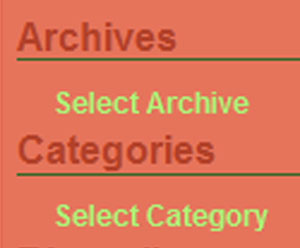
Aaron has made some nifty changes in my sidebar, and I’d like to see what you think about them. Now, under the header "Archives," you see the words "Select Archive." If you hover over that, you will see all of my blog archives, month by month. It seems a little redundant to have the header almost exactly the same as what goes under the header. I was thinking that either the header itself should be what you hover over to see the archived months, but I worry that people won’t get that you are supposed to hover to see the archives. The other option is to have it say "Hover here to see all archived months" or some other directive, but Aaron is here saying he thinks it’s kind of lame when things say stuff like "Click here." Damn, I’ve been writing that for ages. The Category section has the same set of issues. What do you think would be the slickest? I’m aiming for the slickest blog EVER, and so I need your help, Dear Readers.

Comment by Andrew C
June 8, 2005 @ 8:28 pm
OK, I’m bored with doing LDAP upgrades, so here goes…
I wouldn’t use the header for the hover stuff because
it’s not consistent with the rest of the page. Every other
header is just a header, and most people will expect the
bold green text underneath the headers to be links. They’re
more likely to mouse over one of those intending to click on
it than to mouse over the header.
I do notice that nothing below “Archives” renders in
Internet Exploder. Not that I care. 🙂